Monday, May 12, 2014

Field Activity 12: Working with UAS Imagery

Introduction:

The class went out to soccer fields near campus and the Eau Claire Indoor Sports Center to gather Unmanned Aerial Systems (UAS) imagery (the same location as in Field Activity 7.  The imagery was gathered by attaching two cameras to a large balloon (Figure 1).  These cameras were set to take images at set intervals of every five seconds.  One of the cameras collected the images and the geospatial information of the images as well, while the other just collected images.  The balloon was walked around by the class to gather images of the soccer fields.  From here the class was required to mosaic the images gathered by the cameras together in order to create a seamless complete image of the soccer field study area.  Professor Joe Hupy instructed the class to explore some of the various software options to mosaic the images together.  He also explained that some sort of freeware would need to be found in order to attach the geographic information to the geotagged images.

The balloon had two cameras attached to it and was walked around the study area by the class as the cameras took pictures at five second intervals.  This is an inexpensive way to collect aerial imagery with little prior training.  However, if there is any sort of wind, a kite may be a better option than the balloon.  (Figure 1)


Methods:

The class gathered at the soccer fields that were to be the study area.  There was little wind and the cold had subsided for the day, it was near perfect weather to launch the balloon, though the wind did pick up later.  The balloon was filled with helium (Figure 2) and raised up while two cameras were attached to the string.  The cameras began taking images as the balloon was raised up.  When at full height, the class was instructed to walk the area of the soccer fields with the balloon and allow the cameras to do the rest.  Joe Hupy iterated that the course should be walked in a pattern that would ensure overlap of the images to aid in creating a 3D view of the area (Figure 3).

The balloon was filled with helium and allowed to float while the two cameras were attached to the string.  One of the cameras was set to collect geotagged images.  The class then walked around the fields bringing the balloon with them.  (Figure 2)

The track log of the balloon shows how the little bit of wind whipped it around as it was far away from the study area at some points and squiggled back and forth.  Thankfully, enough images were gathered of the soccer fields in order to create a mosaicked image of the area.  (Figure 3)

Once an ideal amount of imagery was gathered it was required to mosaic it together to create the final seamless image.  Two types of software that were recommended were Pix4D and PhotoScan.  The class was told to explore these options.  Drew Briski, a class member had some skills in PhotoScan and was able to help instruct the class as to how to mosaic the images together.  Hundreds of images were taken, though if they were all chosen to perform the mosaic, it would have taken hours.  Instead, for the purposes of learning, thirty-two high quality images taken in succession were chosen to best capture the soccer fields.  The images were also chosen from the camera that had the geotagged data with it in order to avoid having to later georeference the output image.  The program that was chosen to attach the spatial information was GeoSetter, a freeware created to work with geodata such as the data that needed to be attached to the camera (Figure 4).

The images were uploaded into GeoSetter and then the geospatial information was added.  As can be seen on the top right, the images were successfully placed in the correct location over the soccer fields.  This means that the information would hopefully not need to be georeferenced.  (Figure 4)

Now that the images that were geotagged were ready to be uploaded into into PhotoScan and mosaicked together according to the process outlined by Drew Briski (Figures 5-8).

PhotoScan at first appears to be a rather difficult tool that isn't very user-friendly.  However, if the right steps are taken, PhotoScan is extremely automated and mosaicking images is a matter of simply pressing buttons as it is extremely automated.  (Figure 5) 

The images have been added by using the workflow tab and selecting align photos.  This is a point cloud created from the images.  (Figure 6)

After a point cloud is created a mesh and texture can be built to help generate the 3D mosaicked image.  (Figure 7)

This is the final product as viewed in PhotoScan.  It's hard to picture the image in real life though as it is oriented extremely strange.  From here the orthophoto can be exported into a TIFF file to be viewed in ArcMap as a raster.  (Figure 8)

The TIFF of the image was then brought into ArcMap to view over a satellite image and compare to see how well the mosaic performed.  However, it was clear that the image wasn't oriented correctly (Figure 9).  The image would need to be georeferenced with the satellite image in order to come out correctly oriented (Figure 10).

When first brought into ArcMap and compared with the satellite imagery, it was clear that the image generated by mosaicking all of the captured images had some problems.  There was some distortion and the image wasn't oriented correctly.  (Figure 9)

After georeferencing the image to the satellite imagery it appears that the image has come out correctly oriented and with minimal distortion.  Six ground control points were used to georeference the image.  (Figure 10)


Discussion:

This process seemed rather daunting when first laid out to the class.  Images were to be gathered using a previously unlearnt technique, then they were to be mosaicked together using a previously unknown software.  This seemed quite difficult when first explained but it turned out to be a rather painless process.  The gathering of the images using the balloon is not a difficult or expensive task and gathered a good deal of decent quality imagery.  PhotoScan turned out to be rather user-friendly in part to Drew Briski providing a good deal of instruction as to how to use it.  Finally, georeferencing the image was an easy process that had been covered before.  It was however surprising that the image needed to be georeferenced considering it had geo-information attached to it already.  Also, the output image is of an impressive quality considering only thirty two of the hundreds of images were used to create it.


Conclusion:

This activity was a good way to teach the class that using UAS to gather images isn't as daunting as it would originally seem.  Some minor training and attention to details can be put together to put together high quality aerial imagery.  Even using the balloon in this case showed that good aerial imagery in a third dimension can be gathered using the simplest of tools, two normal cameras and a balloon.  The use of GeoSetter also showed that the industry is moving more towards freeware, making this whole process much more accessible.

Wednesday, May 7, 2014

Field Activity 11: Field Navigation using a GPS

Introduction:

This week's activity was a sort of "capstone" to many previously performed activities in the class.  It combined geodatabase creation, ArcPad deployment and use to gather data, field map creation, and field navigation.  The activity involved gathering points in using ArcPad at various stations set up in the woods surrounding the UWEC Priory (see Field Activity 10 for the study area).  The same groups of 3-4 people were assigned and groups were told they'd be navigating the entire course that they'd only navigated a third of in Field Activity 10.  However, this time the groups were allowed to deploy whatever data they felt necessary to a GPS through ArcPad and use whatever maps they wanted.  A large amount of data was provided by Professor Joe Hupy, including the locations of the stations.  Not only would this task be required, but the groups were to be given paintball guns and equipment provided by the geography program and Joe Hupy.

The activity was turned into a competition to see who could complete the course the fastest with rules being set regarding the paintball guns.  The groups would each have a different starting point and would attempt to complete the course from there.  Also, if a group member was shot the group would be required to wait a minute; these minutes would be crucial in determining who would complete the activity fastest.


Methods:

The first step in preparing for the activity was creating a geodatabase to deploy to ArcPad and store all of the necessary data.  The geodatabase was promptly created and the group set to work in trying to decide which data would be used of the data which was provided.  It was decided that the group would create both a map to carry in hand, and deploy data to the GPS.  This was done in order to have as little data as necessary in the GPS to help prevent it from having trouble loading while moving throughout the course.  The map was to contain much more detail and would be referenced if needed.

A geodatabase was promptly created with a domain added with point numbers as short integer coded values between 1 and 15 as there were fifteen points throughout the course.  Creating this coded domain allowed the group to save a little bit of time by just selecting the number from a drop-down menu and avoid error.  With the geodatabase created, a feature class was created in it to gather the station points with the domain properly set (a task learned in Field Activity 6), the group decided that it was crucial to create a path of travel.  The paths were not provided, though the locations of the stations were provided (Figure 1).  The next logical step since paths were not provided was to create paths.  This was done by digitizing lines between all logical neighboring points (Figure 2).

The locations of each station point were given as a feature class by Joe Hupy.  The points were subsequently numbered off and labeled based on the station number.  The Start points were for the previous activity.  In this activity each group was required to start in a different location throughout the course.  Station 5 was the starting point for group 2.      (Figure 1)

Logical paths were subsequently digitized as lines between points that made sense to travel between.  This was done to determine which paths would be the best route by looking at other data.  The red zones are no-shooting zones for the paintball guns.  These zones were to be avoided as much as possible.  (Figure 2)

To help determine the best paths, a slope value was created using a DEM to find the areas with the greatest change in elevation that should be avoided as much as possible to save energy and time.  This, as well as looking at satellite imagery, taking into account distance, and considering the locations of the no-shooting zones helped group 2 decide which paths would be best used and eliminate the rest (Figure 3).  This path of travel, the point locations, no-shooting zones, and the created feature class to gather new points were uploaded into ArcPad and the GPS (Figure 4).  These features were chosen as none of them were too large as to slow the GPS down and they were all the most necessary features.  A map was then created with more detail to help the group in occasions of need (Figure 5).

Three different slope values were assigned based on the slope degree.  Green is low, yellow medium, and red high.  It was attempted to avoid the red areas as much as possible and stay in the green to allow for fast travel.  Also the checkered no-shooting zones were attempted to be avoided.  This allowed for a creation of the red line which is the path of travel.  The idea was that as long as the group stuck to this line, all of the points would be easily found.  (Figure 3)

This is the final product that was uploaded into ArcPad.  It includes the chosen path, the given point locations, and the no-shooting zones.  Also included is the feature class that was to be gathered along the way though it's not pictured here as this is a before image.  These features were all chosen as they were important and not so large as to slow down the GPS.  (Figure 4)

The map created for the activity contained a larger amount of detail than that uploaded into the GPS.  Included in this map is everything included in the GPS, a satellite image of the area, the slope values of the area, and known trail paths in purple.  Also a scale and grid were included, as well as the estimated pace count between each point.  This was referenced several times throughout the activity in order to better situate the group when the info on the GPS was not quite enough.  (Figure 5)

When the class arrived to the location, guns and masks were handed out.  The group booted up the GPS and opened the map file that contained all of the necessary data.  However, the GPS couldn't find the signal because it could not find a conversion of WGS to NAD83.  This caused a problem for several minutes but was solved by opening up a new map and bringing in the required data.  This was a minor problem that was fortunately solved but could have been larger.  Also, it could have been avoided if proper tests were run beforehand.  This is a good lesson to take remember in the future.  The groups set off to their starting points with group 2 heading to point 5.  The point was found easily, along with the first six other points (5, 11, 4, 14, 10, 12, and 13).

The group was already almost halfway through the course when they encountered another team.  The other team held up the group for several minutes and the group actually got separated.  However, they were able to reconvene and continue to the next point, with only one of the group members getting tagged (in the face).  The next point (9) was found with ease as well, though the GPS acted up and had to be saved and reloaded which took up some time.  The path from point 9 to point 8 involved crossing through a no-shooting zone.  However, it was decided to simply go around to avoid any trouble as this area was in the open and it was told to us that it was best to stick to cover and avoid open areas lest people become suspicious of the guns.  This took more time, though point 8 was eventually reached, and the group set off to point 9.  It is here where another team was encountered, holding up the group for another several minutes.  Eventually the two groups passed by each other with a member from group 2 being tagged.  At this point there'd been two skirmishes with two losses.  The group was determined to win the next skirmishes.

Points 3 and 7 were encountered and recorded.  At each station, the group would record the point in the GPS and use the drop-down menu created thanks to setting the domain in order to number the point correctly.  It was near point 15 that a third team was encountered.  This time, all of the opposing team was tagged with one of group 2 being tagged as well (finally success!).  The two groups hung around awhile and chatted about the activity so far.  Though this used time, it reminded everyone that this was really an activity designed to be fun and help everyone use the skills they'd gathered throughout the entire class.

Directly after point 15 was gathered another team was encountered and ambushed with a member of their team being tagged twice.  At this point group 2 had gone through four skirmishes with two wins and two losses (a respectable record).  The final three points were subsequently encountered and recorded (points 6, 2, and 1).  All of the points had then been found and recorded (Figure 6).  Group 2 then returned to the starting location to see that they'd been just beat out by another team.

The blue triangle are the points that were recorded in ArcPad and uploaded into the geodatabase on the computer after the activity was over.  The points are for the most part extremely near where they were supposed to be and all the course points were recorded.  (Figure 6)


Discussion:

This activity was a capstone experience for the entire course and took skills learned in Field Activities 5, 6, 8, and 10 and combined them all into one activity with paintball guns which, of course, raised the pressure.  The initial creation of the database and feature classes along with map design all went extremely smoothly.  However, after he data was deployed to ArcPad, all the group did was open it to see if it was there, they didn't go outside to see if they could get the GPS signal.  This was almost a major problem as right before the activity the GPS wasn't finding, however it was solved by bringing all of the feature classes into a new map.  This taught the group to be sure to always double check and make sure everything works beforehand (a lesson which should have been learned at this point).

The actual navigation went well, with the group having minor problems with the GPS being unresponsive at one point, though this was solved by simply reopening a new map.  Using the paintball guns made the navigation more difficult as carrying he guns and wearing the masks made travel more strenuous.


Conclusion:

This activity reaffirmed many skills learnt throughout the course and even taught some more new lessons.  It also aided in building a stronger camaraderie among the class which is always a good thing to do.  The using of the GPS as opposed to the orienteering method performed in Field Activity 10 was a good contrast and showed advantages and disadvantages of both.

Sunday, May 4, 2014

Field Activity 10: Field Navigation using Orienteering Methods

Introduction:

This weeks assignment involved using previously created field navigation maps in Field Activity 5 in order to navigate a course of points at the University of Wisconsin-Eau Claire Priory (Figure 1).  This navigation from point to point involved using orienteering techniques learned in Field Activity 5 and plotted points on a field navigation map to get from one flag station to the next.  The course was set up by UWEC's Joe Hupy and Al Wiberg, with the help of Zach Hilgendorf, a fellow geography student at UWEC.

Groups were assigned to navigate through a set of five stations spread out throughout an are of approximately 64 hectares.  Groups were made up of three to four people to best allow for distance-bearing navigation to be performed.  As mentioned in Field Activity 5, this form of navigation involves having a bearing finder holding the compass, a pace counter, and a runner.  The five points UTM and lat/long locations were given and had to be plotted on the previously created maps.  Each group was assigned a starting position and then set off from there to navigate to each position, with a punch card, which they could fill out at each station along the way, to prove they had completed the course.

Study Area:

The Priory buildings are the center of the chosen study area.  The area of the course that will be navigated is heavily wooded and very hilly.  The Priory itself sits on a hill.  (Figure 1)

The Priory is a real estate subsidiary of the University of Wisconsin-Eau Claire.  It is currently being used as a children's center and partially as a residence hall.  It is located three miles south of the UWEC campus in a forested and hilly area.  Most of the area of the course is heavily wooded (Figure 2) which made navigation in a straight line rather difficult in some areas.  There are more open areas though they are few and far between and the majority of the course navigation involved climbing through branches (Figure 3), over logs and even streams, and going around large trees, which made maintaining a correct bearing more difficult.  On the positive side, the weather was almost perfect for performing a navigation activity such as this one as it was around 60 degrees Fahrenheit and sunny outside.  This is much better than what last years class had to deal with; according to professor Hupy they weren't performing a navigation activity, they were "snowshoeing".  Thankfully the weather held up this week and helped aid in the groups navigation.

The point course was heavily wooded throughout which increased the difficulty of properly navigating the course as it was very hard to maintain a correct pace count and ensure bearing were constantly set correctly. (Figure 2)

Keeping a pace count was difficult as the logs on the ground and high prevalence of branches throughout the group's assigned point course increased the difficulty of the activity.  (Figure 3)


Methods:

When the class arrived at the Priory, Joe Hupy handed out each of the point station coordinates to each of the groups.  From here the groups were required to plot points on both of the UTM and lat/long maps using meters and decimal degrees respectively.  While the group was plotting these points it was almost immediately noticed that the UTM points were off on the map.  All the maps the group had printed off with UTM grids had the origin incorrectly set.  Professor Hupy explained that this is an easy fix and one simple click can correct it, though for this activity the lat/long maps would need to be used.  This sadly eliminated the group's option of using UTM if desired.  As the course will also be navigated in the future, the corrections will be made to the maps in order to use UTM in the upcoming weeks.

Zach Hilgendorf, a fellow geography student at UWEC knowledgeable in orienteering, then went over a review of how to properly use distance-bearing navigation to get from one point to another on a map.  The first step is to assign roles.  The three roles that are crucial in distance-bearing navigation are bearing locator, pace counter, and runner.  The bearing is found by using a compass (Figure 4) and aligning the edge up with the point currently located and the desired location point.  The direction of travel arrow needs to be pointing towards the desired destination.  Then the north arrow on the compass should be aligned with true north on the map.  The needed bearing can then be found by observing the bearing line.  From here the compass can be lifted off the map.  It is then the bearing locator's job to align the red north arrow up with the red north arrow on the rotating bezel (red in the shed).  The direction of travel arrow should then be pointing towards the exact bearing of the desired location.  From here the runner is sent out to a set landmark/point in the exact bearing of the location.  Once the runner has gotten to this point, the pace counter sets out towards him/her and keeps track of the pace in order to have an estimate of distance traveled.  This can be related towards the distance between the points measured on the map.  This is repeated until arriving at the desired location.

This is a typical compass used for distance bearing navigation.  The labeled features that will be mentioned in this write up are as follows:  1: base plate with ruler for measuring scale, 2: rotating bezel, 3: rotating needle, 5: orienting arrow fixed on rotating bezel used to indicate north,6: bearing line fixed on the base plate, 8: direction of travel arrow
(Figure 4)

The group had all the points plotted and distances measured and was guided to a starting location for course two of the three courses scattered throughout the area surrounding the priory.  From here the first bearing was found and set (Figure 5).  As the group looked to find a good point in the direction of the bearing, the first problem came up.  The forested area was so thick and had no prevalent features that could be properly used to send the runner to.  Due to this the group was forced to keep the runner close, within hearing distance, in order to communicate where to properly stand.  There were only about twenty paces between each area the runner was set to.  It was also quickly realized that the pace count of 65 steps equals 100 meters would not be able to be used as the forest was too dense and smaller steps were required.  Eventually it was settled that 90 paces would be set to be about 100 meters.  The first station (station 6 as the second course of five points was being navigated) was located rather easily after about ten minutes of repeating the process of sending finding the bearing, sending out the runner, and counting the pace.  From here a new bearing was set to find the next station.

This is the exact start point of course #2.  From here the first bearing was found using the orienteering techniques previously taught by Al Wiberg and reinforced by Zach Hilgendorf.  The first bearing was set well as the first station was located easily within ten minutes. (Figure 5)
The next station (station 7) was also easy to encounter, though this was a very difficult part of the forest to navigate through (Figure 6).  It took approximately twenty minutes to encounter station 7 from station 6.

What would have been a short stroll between station 6 and 7 was turned into a difficult climb through the thick forest.  Due to this, a walk that would have taken about three minutes in open ground took almost twenty minutes of navigating through the forest to encounter.  However, the seventh station was exactly where it was expected to be, unlike station 8.  (Figure 6)
The next station to find was station 8.  A bearing was set and the group set off, the runner going first followed by the pace counter and bearing setter.  The pace was counted and after observing the navigation map (Figure 7) the group believed they were in the correct location to see station 8, however it wasn't anywhere in sight.  The bearing setter stayed in one place while the other two group members went out to explore and see if they could locate the station.  After extensively searching station 8 was found with the help of another group looking to encounter it, though it was in a location that didn't appear correct on the navigation map that was created according to the given coordinates.

Station 8 was difficult to find.  It is hard to determine if this is due to navigation error or placement error of the point as the actual station seemed to be much nearer to the highway (further north) than the map and given coordinates tell.  The possible incorrect location of this point contributed to difficulty in locating station 9 as well.  (Figure 7) 

At this point, encountering the next point (point 9) was difficult as it wasn't where it was believed to be, even with two groups navigating.  This once again points to point 8 being incorrect, which in turn, made it difficult to find point 9.  Though after about 20 minutes of searching beyond just the navigation, the point was encountered.  From there, the final station (point 10) was encountered easily and the navigation activity was completed (Figure 8).

A different "punch" was obtained at each station.  This card shows the five punches obtained from stations 6-10 proving completion of the activity.  (Figure 8)


Discussion:

The distance-bearing technique used in this activity had its advantages and downfalls.  It was more difficult to navigate using this technique in thick woods than expected.  This is because it was hard for the bearing setter and the runner to completely distinguish a key point to stand to be at the correct bearing due to the large presence of many smaller trees and branches.  It was also difficult to keep an accurate pace count as stepping over logs, around trees, and under branches made it extremely difficult to fully estimate what pace equaled 100 meters.  On flat ground around 65 steps equals 100 meters, the group decided to go with about 90 steps equaling 100 meters, though at times this was inaccurate due to rapid changes in the slope of the elevation or the aforementioned thicket.

Despite these downfalls, the first two points (which were the stations in the thickest portion of the course) were encountered easily due to excellent bearing setting and navigation by the group.  Where the group encountered a problem was with point 8.  The point was far from where it appeared on the map, which was plotted based on given coordinates.  These coordinates were taken with a GPS earlier when the course was set up and could be inaccurate.  Although another possibility is that the group just slipped up in the navigation.


Conclusion:

The activity went extremely well due to the favorable weather and large amount of preparation on the instructors' parts.  The groups all managed to properly navigate through the assigned course with only a few hiccups (darned point 8).  Next week the class will be navigating the same courses but using GPS devices instead of the low-tech distance-bearing navigation.  It will be interesting to see how these compare, especially with the large amount of canopy cover that could throw off the GPS signals.

Wednesday, April 16, 2014

Field Activity 9: Surveying with a Total Station

Introduction:

This week the class was to go out and survey the University of Wisconsin-Eau Claire campus mall using a Topcon total station (Figure 1) provided by the geography department.  In Field Activity 4 (Sunday, February 23rd, 2014), the class performed a distance/azimuth survey.  This previously learned method works well in many ways and is quite simple.  However, more accuracy is at times needed, and elevation data is also nice to have.  Surveying using a total station provides these, at times, desired options.  It takes elevation data and is usually more precise than a simple distance/azimuth survey.  This however, comes at a cost.  This cost is both seen in monetary amounts and in convenience.  The total station that was used to complete this activity costs over $4,000.  Also, the set up of the total station is much more complicated than the point and shoot method of the distance/azimuth survey.

This is a total station built by Topcon.  It can be used to more accurately survey an area than a distance/azimuth survey laser and also provides elevation data.  This device can cost upwards of $5,000 and is more complicated to set up than a simple distance/azimuth survey. (Figure 1)

The class spent the in lab period learning how to set up and operate the total station using a GPS that would be connected via Bluetooth to the total station.  The set up involved first learning that the equipment is extremely expensive and should be handled with care, and also that in order for the total station to work, everything needs to be leveled.  Properly leveling off the total station can take some time and involves adjusting the tripod legs and black nobs on the total station itself.  After the station is all leveled, the GPS needs to be activated and connected via Bluetooth.  From here the instructor, Joe Hupy, walked the groups of three through the process of being completely prepared and setting a backsight, which is necessary to collect points and will be further explained in the Methods section.

Each group was to get together and collect their data of the campus mall.  From here the groups would be required to upload the data into ArcMap and create feature surfaces similar to Field Activity 2 using surface interpolation.  These surfaces should ideally mimic the actual campus landscape.


Study Area:

The newly redesigned University of Wisconsin-Eau Claire campus (Figure 2, Figure 3, and Figure 4) was the area in which the survey was performed.  Recent renovations to the campus mall have greatly expanded it.  It is now a large open area which includes Little Niagara Creek as a main feature.  The weather was a pleasant spring temperature and slightly cloudy; as long as it didn't rain the study could have been performed.

This image shows the main portion of the campus mall.  As can be seen the image slopes slightly down in one direction toward Little Niagara Creek on the left.  (Figure 2)

This image shows another view of the campus from the
 total station.  This is facing the newly renovated
 student center and shows the downward slope towards
 Little Niagara Creek.  (Figure 3)
This is a backwards view from Figure 2 above.  It
shows one of the higher flatter areas of campus.  It can
be seen that the campus mall is new by looking at the
freshly planted trees.  (Figure 4)


Methods:

The group obtained all of the needed equipment from the geography lab and set out to the center of campus to begin collecting data.  The total station was set up and leveled off as was shown in the learning session, and the study area was defined.  How the study area was defined is a group member took four flags to place at each corner of the approximate hectare that was to be established.  The hectare was defined by using a pace count (see Field Activity 5) and turning approximately 90 degrees in order to get a square 100 meters.  This wasn't exact as there are parts of campus that are too narrow because of buildings to have an exact 100 meters across.

The group then connected the GPS to the total station and collected an occupy point.  The occupy point is the point directly where the station is placed when it is collecting.  It is taken by simply taking a location using the GPS, in this case the mapping grade GPS took an average of twenty points to calculate the occupy point.  Referencing the occupy point is key in the total station being able to place the points it measures out in space.  From here the group began to set the backsight.

The backsight is required in order to begin taking any points.  A backsight involves taking an azimuth measurement manually and then firing the topcon laser into the total station reflector (Figure 5), which is how points are collected.  This allows the total station to calculate the azimuth of the direction it is facing, which it cannot do without manually setting a backsight.  The azimuth of the backsight was just measured with a compass.  This seems like a simply process, however the group had problems getting the total station to measure out the backsight.  As it turns out, the total station is a delicate machine and needs to have the firing laser faced a certain direction on the station.  Once the laser side of the machine was flipped around, the total station began working exactly as it should.

This is a smaller version of the total station reflector.  The total station needs to be aimed at the center of the prism in order to calculate the distance and azimuth from the total station.  One person walked around holding the rod with this prism on the end level while the other two would aim and fire the total station, recording points.  By knowing the height of the rod and of the total station itself, the total station can calculate elevation. (Figure 5)
Each member of the group rotated either aiming the total station laser at the prism (Figure 6), holding the prism, or manning the GPS as the group was comprised of three members.  A pace count was used to spread out the points in most of the flat areas.  The area by the creek required a more staggered point placing, with points being taken to reflect the real world rapid changes in elevation near the creek (Figure 7).


Here Brielle is insuring the total station is level as she aims it at the reflecting prism.  The other two group members are off to the side either holding the reflecting prism at a desired location or pressing measure on the GPS to gather the points via Bluetooth.  (Figure 6)

This is an image of the points locations after they were uploaded into ArcMap.  These points are correctly spaced, however the satellite imagery is outdated.  The old student center was located where the current campus mall is and where the study took place.  The location of the new student center can be seen in Figure 3 as being across the creek at the bottom of the satellite image.  It can also be seen that as the elevation changed more rapidly near the creek, it was required to take more points to best represent the natural rapid changes in elevation.  From here the points could be run through spatial interpolation to create a surface of the terrain in ArcMap and display it in ArcScene.  The total area of points is approximately a hectare.  (Figure 7)

Approximately 130 points were gathered in total.  After the collection was finished, the equipment was packed up and the points were brought into Excel as a text file.  From there x and y coordinates (using UTM as the data was gathered in UTM zone 15) were converted into a feature with an elevation z.  Spatial interpolation (kriging method) was then run in order to create a surface that represents the terrain of campus (Figure 8).

This is a representation of the campus terrain that was created using the points gathered in the total station survey.  Kriging was used to convert the points into a raster that included elevation data.  the downward slope of the campus mall and the creek are two noticeable aspects of this feature which reflect the real world for the most part.  Some irregularities are the portion of higher elevation in the creek bed caused by a bridge, and the lack of the creek continuing to be represented upstream.  (Figure 8)

The surfaces created from various groups was then compared (Figure 9) to see the various differences in study area and to see if there were any irregularities in any surveys.

These three surfaces of campus were created using three different groups' points.  They were all created using kriging interpolation.  As it can be seen, different groups decided on the approximately hectare-sized area of campus they would survey differently.  However, the change in elevation is reflected similarly in each surface, the stream in the images stands out as a clear feature that each of these groups captured well for the most part.  The different surfaces appeared at different elevation, likely due to the inaccuracy of the z value of the GPS.  (Figure 9)


Discussion:

As the surfaces are observed, there are several things that stand out.  The surfaces created by the different groups for the most part accurately represent the slight downward slope of the campus surface to the creek.  However, in the surface created in Figure 8 the creek appears to be somewhat unnatural as it doesn't continue upstream as it actually does in the real world.  This is likely due to a lack of taking points to the edge of the survey area along the side of the creek.  Next time this survey is done, the groups will need to be sure to take points to the limits of the survey area in a case like this in order to better represent natural features.

A real world feature well represented in the surface in Figure 8 is the area directly surrounding the creek.  The group was sure to take more points along the areas in which the change in elevation was greater to try and ensure that the data would be as accurate as possible.  Due to this it appears that the areas alongside the edge of the creek in Figure 8 are well shown.  However, the creek does have a noticeable irregularity.  There is an area of higher elevation along the creek which appears extremely unnatural.  This is due to a bridge being in that area and the land sloping up to greet the bridge.  The bridge could be better represented if some other method to gather data around it or to represent it was used.  In the surface in Figure 8, the bridge simply appears to be an error, so it's important to mention what it actually is.


Conclusion:

Earlier in the semester, the class used a distance/azimuth survey method to survey an area.  This past week, the class stepped it up a level and used a total station to survey a study area.  The total station, while more complicated to set up and much more sensitive, provides a higher level of precision and also provides elevation data which is extremely useful in many cases.  Through the processes of this lab, the class learned how to properly deploy a total station, gather points, and bring them into a GIS in order to analyze them for accuracy.  This activity also took a large amount of group work and collaborating to make surveying work well.  Thankfully the various groups have gotten good at working together and this greatly aided in making the total station survey run smoothly.

Sunday, March 30, 2014

Field Activity 8: Gathering Data Using ArcPad and Development of Microclimate Maps

Introduction:

This weeks field activity involved using a previously constructed geodatabase prepared for ArcPad (see Field Activity 6) in order to gather data as a class and develop a microclimate map of the UWEC campus.  Seven groups were created and each group was assigned an area to survey using a kestrel weather detector (Figure 1) and a Trimple Juno 3D GPS with ArcPad installed (Figure 2).

This is one of the Kestrel devices that was used in order to gather weather data.  The information that was gathered using this device included:  relative humidity, dew point, temperature, and wind speed.  (Figure 1)

This is one of the Trimble GPS devices that was used to gather the point data for the microclimate maps.  The Trimble had ArcPad installed and each group had to upload their own created geodatabases (which were created in Field Activity 6) to the Trimble.  From here, data could be recorded at set positions.
The challenge with this activity would prove to not be the data gathering itself but to actually be figuring out how to combine each group's data into one feature class for analysis and displaying on a microclimate map.  This is because not every group used the same names for gathered data and some data was recorded differently.  For example, some groups had an attribute titled "temperature", while others simple had "temp".  Another example is that some groups recorded wind direction as "North", while others abbreviated and simply had an "N" to represent North.  This challenge would need to be overcome once the data was all gathered completely.


Study Area:  

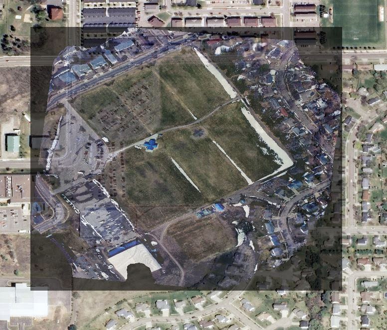
The campus of the University of Wisconsin-Eau Claire (Figure 3) would be the study area for the microclimate map.  The class was split into seven groups and was assigned areas throughout the campus to gather data.  On this particular day, it had been snowing rather heavily for several hours and the temperature had been steady at around 32 degrees Fahrenheit, just warm enough to prevent groups from freezing their fingers off while collecting data.  As data collection began the snow was continuing to fall.  However, after about a half an hour of point collection and recording data, the snowfall ceased and the weather seemed to change slightly as the sun came out.

The Eau Claire campus is split into three main zones, there's lower campus, upper campus on top of a large hill made up of Putnam Park and the area across the bridge.  The groups spread out throughout these three areas to gather data.  It will be interesting to see whether the hill or the river have any effect on the microclimate maps.

This is a satellite image of the University of Wisconsin-Eau Claire campus which is the setting for the microclimate maps designed in this week's activity.  The west portion of campus in this image (to the left) is on top of a hill while the eastern portion makes up lower campus.  There is also a part of campus across the river that can be seen at the top of the satellite image.  This satellite image was used as the basemap for the microclimate maps. (Figure 3)


Methods:

Preparation and Data Gathering:
The very first step in preparing to create the microclimate map was insuring that the geodatabase, basemap, and feature class created in Field Activity 6 were checked out to the ArcPad on the Trimble GPS (Figure 2).  This involved first preparing the data in ArcMap and checking it out to a separate folder (Figure 4).  From here the Trimble was plugged into the computer and the data was copied over into the Trimble.

This is a look inside the folder of the data that has been checked out of ArcGIS to be used in ArcPad.  The data features the created geodatabase, a basemap of the study area, and a feature class ready to be edited in ArcPad.  This whole folder was copied into the Trimble GPS. (Figure 4)
The information that was to be gathered was:  temperature, relative humidity, dew point, wind speed, wind direction, time collected, and snow depth.  In order to get this data, tools that were needed included a meterstick, a kestrel (Figure 1), and a compass.

When outside, gathering the data was as simple as having one of the two group members plot the point with the Trimble, and record the data while the other group member held the kestrel and listed off the recorded numbers.  This was an easy, yet monotonous process as many data points had to be gathered in order to try and get an accurate representation.  However, if too much time was taken it could be possible that the weather would change, this actually occurred as it stopped snowing part way through data collection.  Some groups even saw dew point drop throughout the process.  

When around 50 points had been gathered, each group headed in to upload their data.  It was at this point that the instructor Joe Hupy informed the class that they would need to put all of the data in one folder and from here figure out how to get every groups separately labeled and classified data together as one feature class, which proved to be no small order.

Data Merging:

At this point all the data had been gathered and uploaded to a class geodatabase from each group (Figure 5).  However, all of this data was at that point, useless.  This is because every group had classified their feature class differently.  The seven separate feature classes (Figure 6) would need to be combined into one.  This proved to be difficult due to each group had labeled or recorded their attributes differently (Figure 7).  None of the groups had done it right or wrong, they had just all done it their own way.  In order for the feature classes to be combined into one for analysis and map creation, the attributes would first have to be joined together.

This is the view inside of the class geodatabase.  Each group had created their own feature class when they'd gathered data.  These feature classes alone have almost no use when trying to create a microclimate map of the entire campus.  Therefore, the feature classes needed to be merged into one feature class that encompassed them all (Figure 5)

When each group uploaded their data, the class was confronted with seven different feature classes.  This shows the view of the seven different feature classes on the Eau Claire campus without the basemap.  It's difficult to design a map that uses all of the feature classes equally when there are so many.  In order to take the next step the feature classes needed to be combined. (Figure 6) 

This is a comparison of the feature classes from Group One and Group Two.  As can be seen, the attributes are all different.  Group One used "windspeed" to represent the speed of the wind in miles per hour while Group Two used "wind_s".  These little differences can cause a big headache when trying to combine a group of feature classes into one and they appear throughout the seven groups' feature classes. (Figure 7)

The Merge tool combines multiple input datasets of the same datatype into a single, new dataset.  It can be used to combine point feature classes such as the seven that were present for the microclimate map.  This was the clear solution to the problem, however, it wasn't as easy as it would originally seem.  As the Merge tool combines the feature classes it allows the user to map the fields (Figure 8).  In other words, it allows the user to take input fields (attributes) from the input datasets and turn them into output fields (new attributes for the new feature class).  This was the key in combining the feature classes because if the different attribute names for the same attributes for each feature class could be determined, then they could be mapped together to be combined as one output using the format of one of the feature classes.  In other words, the values under "rel_humid" for Group Two could be combined with the values under "relative" for Group One (Figure 9).  The output would also have to be chosen, and it was deemed easiest to simply keep Group One's output titles so each feature class's attribute data would eventually end up being classified under the Group One field names.  In this way the final feature class ended up having the same field names as Group One's original feature class.  This can be done in different ways, and this way was simply the one chosen this time.

This image shows the merge tool with the inputs of Group One and Group Two's feature classes.  All seven of the separate feature classes could have been input in one step, yet this was deemed to be too messy and prone to mistakes.  Due to this, the merging process was done methodically; merging 1 with 2, then 3 with that merge, then 4 with that merge and so on.  This process was continued until all of the feature classes were merged into one. (Figure 8)

This is the field map area of the merge tool.  In this image Group One's attributes have been merged with Group Two's.  This is done by selecting inputs for the field maps.  These inputs are the sub-selections coming off of the main output text.  It was deemed easiest to keep the output attribute field names the same as Group One's throughout the whole process. (Figure 9)

The most difficult part of this process was avoiding making a simple mistake.  Each feature class's attribute tables had to be analyzed in order to determine which field names represented which attributes.  In order to avoid error, instead of inputting all of the feature classes at once to be merged, the feature classes were merged methodically one at a time (Figure 10).  Group One was merged with Group Two.  Then Group Three was merged with the resulting merge.  Then Group Four was merged with that.  In this way, there were only ever two inputs at a time; this may have taken longer but helped eliminate error that could be associated with dealing with an extremely busy field map menu.  In the end, the resulting feature class was a combination of all of the feature classes with all of the relevant attributes.  There was, however, still many null values where data hadn't been recorded by some groups but had been recorded by others such as wind azimuth.  These little errors would complicate slightly the designing of the microclimate maps.

These feature classes show that methodical process that was used to merge the original seven feature classes.  This process was used in order to avoid having to work with a very busy field map menu and avoid human error.  One and Two were combined, which was then combined with Three, which was then combined with Four and so on. (Figure 10)

Map Design:

With all of the feature classes finally merged into one, it was possible to begin map designing and analysis of the feature classes.  When trying to first create a raster using the points that were in the feature class something was apparently wrong.  Upon inspection of the points and thanks to collaboration among the class, it was discovered that some points were sitting somewhere on the Equator.  This was likely due to mechanical error and the points were promptly deleted.  From here, designing rasters using the points went much more smoothly.

The first analysis of the data showed that points near the water appeared to have a slightly higher dew point than those away from the river (Figure 11).  Finding the dew point is one way of measuring the moisture in the air and is represented as a temperature.  The nearer the dew point is to the actually temperature, the more moisture in the air.  It is important to consider that dew point temperature should never exceed the temperature of the aire.  A raster of the dew points was created using natural neighbors.  From here on out all of the rasters were created using this method.

An apparent pattern in this map is that the data gathered by the group near the river had higher dew point values than those on the rest of campus, save a small pocket near the nursing building. (Figure 11)

Another way to measure the moisture in the air is using relative humidity.  It is represented as a percentage of moisture in the air.  If dew point temperature equals actual temperature then relative humidity is 100%.  From here, a raster representing relative humidity was created (Figure 12).

This map shows the relative humidity of areas on campus.  It's interesting to not that the majority of the high humidity values are far from the river and are near the bottom of the campus hill along Putnam Park.  The weather was snowing at first and some drops were noticed in relative humidity over time as the sky cleared and the sun came out.  This cluster of high relative humidity may be due to these areas being close to the science building and being recorded earlier than the others points, before the weather began to change. (Figure 12)

The next step was to combine the dew point and relative humidity data into one map (Figure 13) as the two numbers both represent the amount of moisture in the air in different ways.

This map attempts to show the relationship between relative humidity and dew point as it pertains to the data gathered by the class.  It is however, rather difficult to see any distinct pattern in the map when it comes to the comparison of the two variables.  One slightly noticeable pattern is that the lower and higher dew points in the southern portion of the map have the same border as the lower and higher relative humidity values. (Figure 13)

Temperature is one of the main measurements people think of when they think "weather".  Therefore a temperature raster was created using the points (Figure 14).  This was then made into a map of the recorded temperatures throughout the campus.

This is a map of the recorded temperatures around campus.  One noticeable pattern is that the area to the west, which is on top of the large campus hill, appears to have been slightly cooler than the rest of campus.  Also a surprising result is that the area by the river was one of the warmer areas that day.  In the center of the campus is an extremely hot area which was the result of being near a vent of a building. (Figure 14).

Two other variables of the weather around campus which were recorded were wind speed and direction (Figure 15).  It appeared the overwhelming direction of the wind was from the West.  In order to create this map, wind azimuth was needed and the symbols were rotated accordingly.

This map represents the wind speed and direction on the campus at the recorded locations.  The large majority of the wind seems to be coming from the West and some from the North.  There are however interesting patterns around the building in which the wind appears to be whipping around them, changing up the wind direction. (Figure 15)

Snow depth is another variable that each group measured (Figure 16).  Something to keep in mind is that this value is extremely dependent on where the points were taken considering it was up to each group to decide what exact locations to record values.  This could skew the results from reality.

This is a map of the recorded snow depth in centimeters on the UWEC campus.  The areas down by the river appear to have deeper snow depth, while the areas around campus, except a few very deep areas, seem to be less deep.  This may be due to the clearing of snow from the campus by campus workers. (Figure 16)


Discussion:

The process of going out and designing these microclimate maps was educational in many ways.  Firstly, simply learning how to gather data using ArcPad and proper use of a kestrel are great lessons for the future.  Using a Trimble GPS may seem like a trivial matter, thought there are many things to know to use it well; an example of this is that the GPS should be help out away from the body when gathering points, if someone were to hunch over the GPS it might skew the points.

The most important lesson that was learned is that it's extremely important to coordinate beforehand.  When the groups gathered their data, they each chose areas to gather the data, but that's pretty much the extent of the cooperation which occurred.  The result of this is that despite the groups having gathered similar attributes, there was no common names for these attributes.  This led to more work in the long run, however, the class began cooperating well after this insuring that the data would have everything required such as wind azimuth, which some groups didn't end up recording.  Also, planning out a methodical plot of where to gather points before hand would have helped prevent groups from simply going out and gathering random points where they saw fit.  This may have helped improve the quality of the maps.  Sadly it's hard to pick up on patterns in many of the maps as there are no obvious ones.  One can't help but wonder that if the activity and data gathering had been done more methodically if the quality of the data and maps would have been improved.  

Also the note section of the data was most of the time neglected.  This is even after the instructor Professor Joe Hupy affirming that the notes section is one of the most, if not the most, important section.  Many groups said that they tried to record notes however something went wrong in the process and they were unable to type anything into the field.  It's possible that the notes section could have helped explain some anomalies in the data such as the random deep portions of snow (Figure 16) and the extremely hot areas (Figure 14).

One aspect that was noticed by some groups is that the change in the weather affected their numbers.  Particularly the day that this data was collected (March 24th) it was snowing rather heavily.  However, after 30 minutes to an hour outside, the wind picked up, the snow stopped, and the sun came out.  It may have been possible to see this transition in weather, however some groups failed to fill in the field regarding time the data was gathered.  Even though this can't be represented due to this, the quick and drastic change in the weather may have had effect on the data.


Conclusion:

Even the construction of something as simple as a microclimate map should not be taken lightly.  There are so many aspects to consider regarding preparing the geodatabase with the proper feature classes and attribute names, getting it onto a device such as a Trimble with ArcPad to collect the data, collecting the data using proper measurements and recording everything needed, then getting the data back onto the computer to be analyzed and represented using a GIS.  Even when all of these steps are planned ahead and done well, when working with a large group it's likely that something will have been missed or something needs to be done to insure that everyone is up to speed and everyone's data is normalized in some way.

This field activity not only greatly aided in the process of teaching the technical aspects of designing a microclimate map and using ArcPad, it also aided in teach how to work as a large group.  This being the first activity where the class really worked together as a whole, it was important to communicate to insure everything ran smoothly.  While the communication could have been better, especially beforehand, the activity turned out well in the end.